| Category / Domain : | Interface |
| SCOL Voy@ger Compatibility : | V 3.5 or above |
| Update : | 2001/06 |
The GraphicButton module displays a button on the client interface. It can be customized
using a bitmap.
This button is used to start an action in the 3D scene or in the interface.

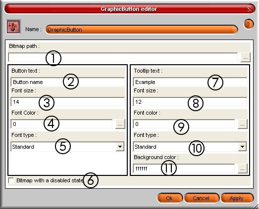
Figure 1 : GraphicButton module interface
(1) : Bitmap path => Indicates the path of the bitmap used for the button ; to click on
... to select a file which will have to be saved in SCOL partition.
This file (.BMP,
.JPG or .PNG) can have any size but its shape of cutting must be strictly the same as the
one of the button.
If no image is provided or that the filename is not valid, the button is a text on white
area. If it is the file itself which is not valid,
the button will not be created and
the client part of the module will be canceled.
(2) : Button text => Allows to indicate the text which will be visible on the button
(3) : Font size => Specifies the size of the font used for the text of the button
(4) : Font color => Specifies the colour of the text of the button
(5) : Font type => Specifies the style (normal, bold, italic, underlined, strikeout)
(6) : Bitmap with a disabled state => The image is different when the button is disabled.
(7) : Tooltip text => Allows to indicate the text in the tool-tip
(8) : Font size => Specifies the font size used for the tool-tip text
(9) : Font color => Specifies the colour of the text of the tool-tip
(10) : Font type => Specifies the style (normal, bold, italic, underlined, strikeout) for the text of the tool-tip
(11) : Background color => Specifies the background color used for the text of the tool-tip
| Action | Function |
| module.event ŕ Graphicbutton.start | Allows to start the module and to show the button in the client graphic interface |
| module.event ŕ Graphicbutton.destroy | Stops the GraphicButton module at the client side |
| module.event ŕ Graphicbutton.show | Shows the button at the client side |
| module.event ŕ Graphicbutton.hide |
Hides the button at the client side |
| module.event ŕ Graphicbutton.enable | Activates the button |
| module.event ŕ Graphicbutton.disable |
Deactivates the button |
| module.event ŕ Graphicbutton.click | Allows to simulate a click of the button by a user. |
| Event | Function |
| Graphicbutton.click à module Action | Generates an action when clicking on the button |
| Graphicbutton.in à module Action | The client part of the module is started and ready to receive events |
| Graphicbutton.out à module Action | Exiting from the module generates an action |
| Graphicbutton.entering à module Action | Entering in the module generates an action |
| Graphicbutton.shown à module Action |
The display of the button generates an action |
| Graphicbutton.hidden à module Action |
Hiding the button generates an action |
| Graphicbutton.enabled à module Action | The activation of the bitmap on the button generates an action |
| Graphicbutton.disabled à module Action | The deactivation of the bitmap on the button generates an action |
| Zone | Function | Interface | Assignment |
| GraphicButton.button | Shows the button | Client | Yes |